UX Design
Print to Digital Publication
The Project
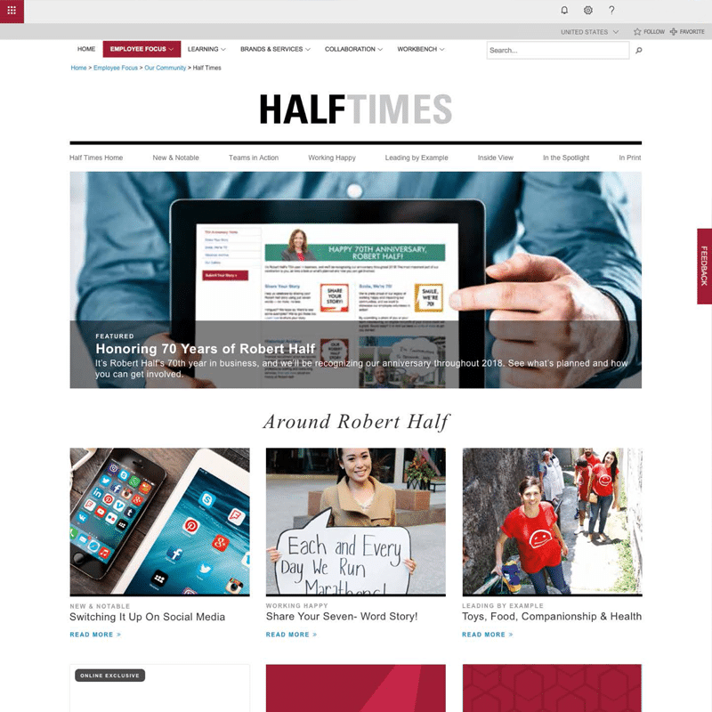
Customer requested an in-house print publication be added to the company intranet. This was an exciting project, starting the UX and visual design from the ground up. Challenges included integration into current intranet design, user familiarity with content when transferred to a digital version, and meeting customer’s development needs.
With the launch of the new responsive digital publication, content was now available to over 16,000 employees world-wide, on all platforms and screen sizes. There was an 80% spike in page visits and readership, an outcome that exceeded the customer’s expectations.
Role
Project / UX Design Lead
Researcher
User Survey Facilitator
BRD, Project Scope Author
Team
UX Designer
Visual Designer
Content Specialist
Developer
The Process
Preliminary meetings with the customer revealed the expectation of the digital version to reflected the print publication. Competitive research and deeper questioning lead to the following UX and visual design recommendations, which were met with enthusiasm:
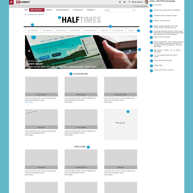
- a micro-site housed in the existing Intranet site
- a second navigation bar with different styling to distinguish the micro-site from the Intranet site
- print sections to be combined and/or discarded for the online version
- user testing for navigation and titles
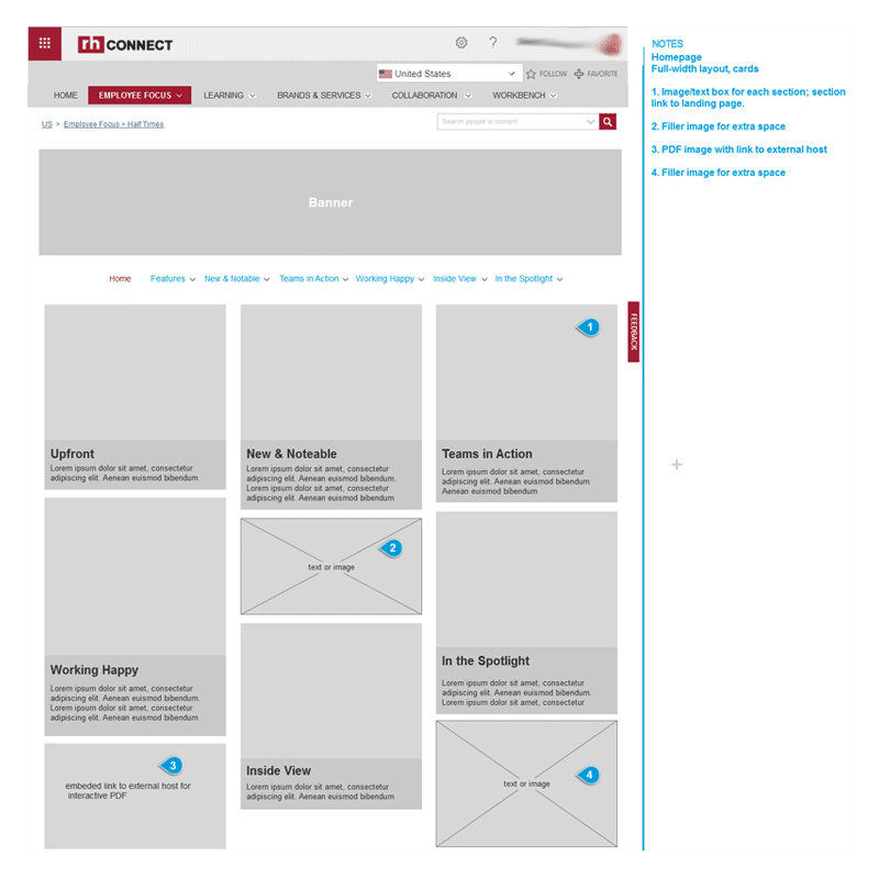
- wireframe and design iterations for review
- responsive design across all screen sizes and platforms
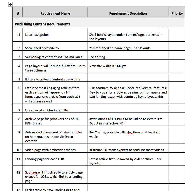
The customer’s requirements included:
- ability to edit and update text and images
- rotating banner on homepage
- latest article from each navigation section to appear on home page and related section landing page
- ‘related stories’ section module
- section modules for number of photos and their page placement on ‘article’ pages
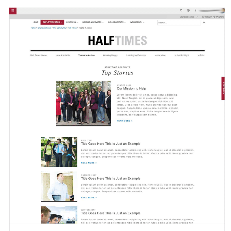
- section landing page with featured hero image and text at top
- section landing page listing ten (10) articles, chronological order, following hero image
Requirements were tracked in a BRD and delivered to the Development team for implementation.
User Insights
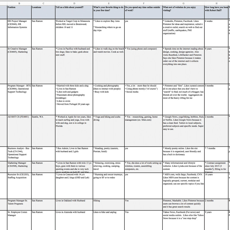
The print publication was distributed to international and domestic company offices. The issues were not seen by all employees due to the constraint of publication costs, shipping and need. This was confirmed by the user interviews done with international employees, who also requested content that included more of their stories and not just that of the domestic offices.
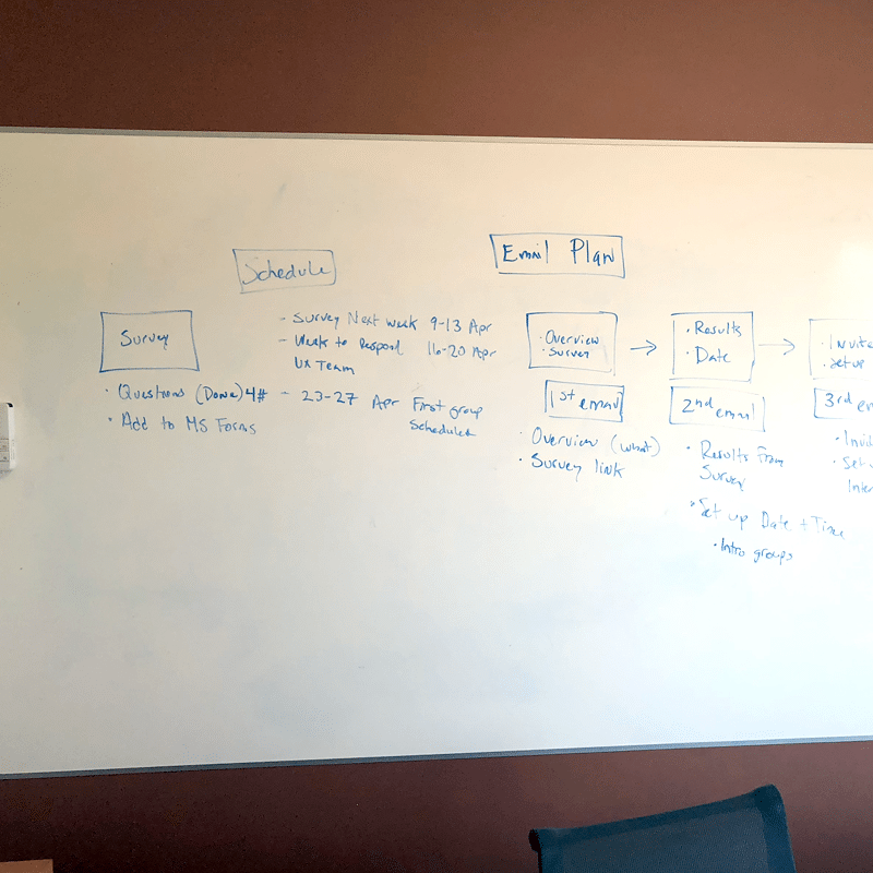
The navigation sections were to reflect the sections in the print publication. It was important to test the addition of a secondary navigation bar. Interviews, both face-to-face and via Skype were conducted over a three week period. Surveys were schedule with both employees and managers with various tenure, location and jobs.
Questions included:
- familiarity with print publication
- recognition of section titles
- how to return ‘home’
- locating sub-sections
Results showed that 90% of users were familiar with the publication and contents. Almost all had no problem with section titles and navigation. Insights gained from the international customers revealed they did not always feel included in the publication content. There were suggestions for additional sections. 100% of users were enthusiastic for the digital version to be available.
The conclusion was that the secondary navigation was not an issue and would be well received. The customer was presented with these results and agreed that more relevant content for international employees would be included in the future.
Deliverables
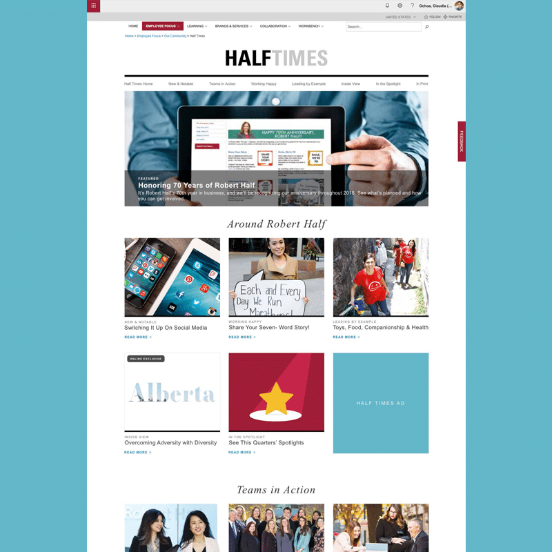
Once the final UX and visual iteration was signed-off by the customer, QA was done for the site by both the project team and the customer. A style guide was written and the customer was trained to update their content in the SharePoint environment. The new micro-site was launched on time and at budget. Additional user testing will be done at a future date.
It was exciting to break away from the Intranet styling and offer the customer a new, fresh design. The magazine micro-site styling, differentiated from the Intranet styling with san-serif fonts, photo styling, use of grays for fonts, centered content and single column layout. All photos were original content, which added authenticity and freshness to the micro-site.
The customer would be followed up with to make sure the new site was working as expected and if they wanted to discuss any changes or updates. At launch, they were quite pleased with the deliverables, customer service and follow-up.

