
UX/Visual Design
Portal update
The Project
The portal site needed UX and visual updates to conform to the company’s updated Intranet. User research was a key part to the success of the redesign.
Role
UX Design Lead
Visual Designer
User Survey Facilitator
Team
UX Designer
Visual Designer
Content Specialist
Developer
The Process
The company’s Intranet site had been through a recent responsive redesign. The portal needed to reflect the new style and UX changes, without compromising content, on laptops, tablets and mobile screens.
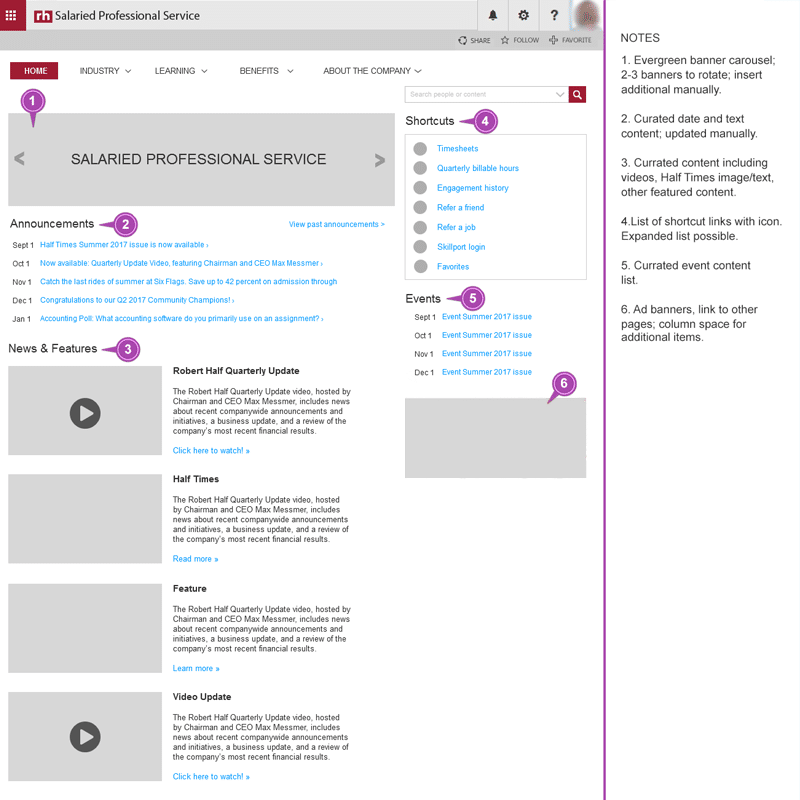
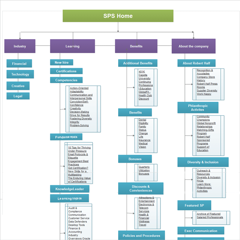
A UI inventory was brought to the customer for discussion, to make sure all sections were still current. After listening to the client, the following recommendations were made:
- leverage all Intranet styling
- keep modules (favorite links) that were most popular in use
- move newest and most relevant content to top of site
- post videos on front of site for better visibility
- provide consistent navigation on all pages
Before moving to any wireframes or prototypes, user testing was needed. With the information gleaned from the user testing, the customer was presented with section/content and UX recommendations.
With their approval of the site recommendations, work was begun on wireframes and visual design. After a few iterations, a final design was chosen for the site re-launch. The new site proved to be more useful for the users and the customer was pleased with the increase of 30% in site use and visits.
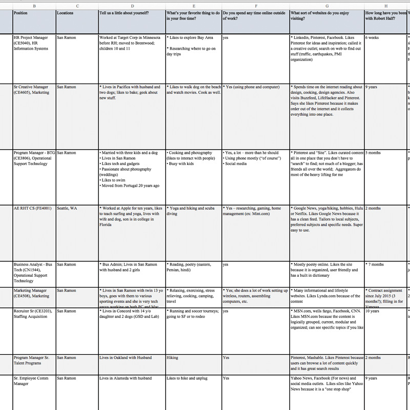
User Insights
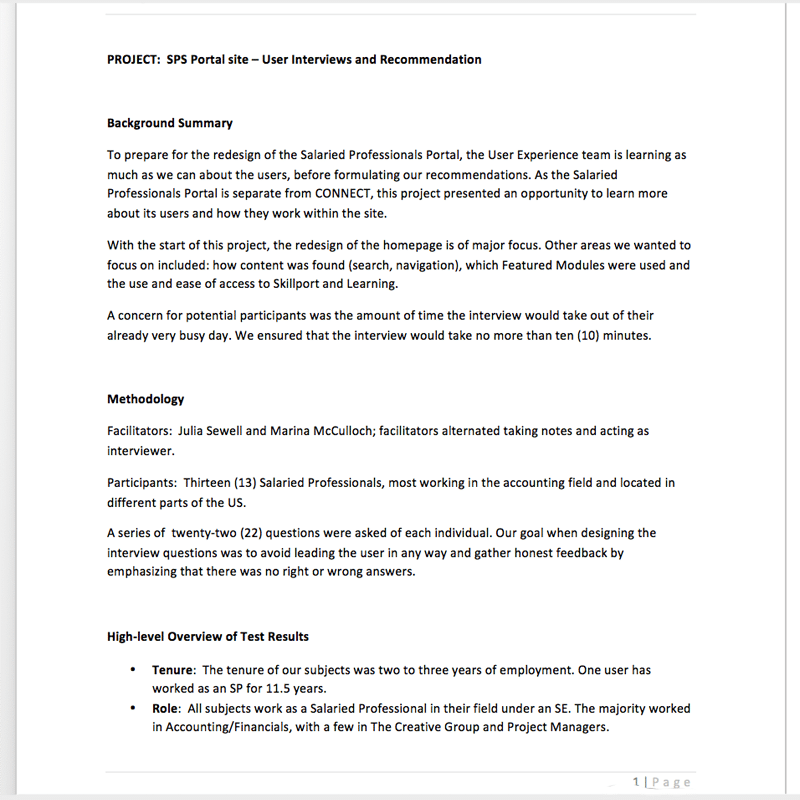
In order to fully identify UX and design changes for the site, user testing was set up over a period of four weeks. Both face-to-face and Skype interviews were conducted. The users surveyed were corporate, management, remote and in-house, different genders, ages and tenure.
The focus of the twenty-two question survey included: how content was found (search, navigation), which modules (favorite links) were used and the use and ease of access to external learning sites.
The overall impression from the interview subjects is that they found the Portal easy to use and had content they needed readily available. One common issue was a lack of time to explore the Portal and make use of the content and features.
Search and navigation issues with finding content were prevalent. Many users were confused with how to navigate the site, using email links and even the footer links, instead of the top navigation links. Overall, the existing layout portal was effective and efficient for the users.
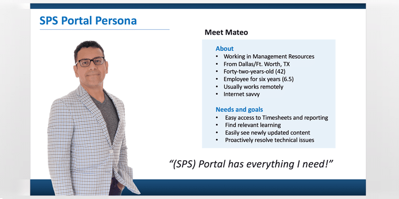
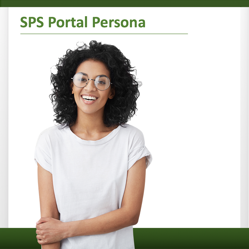
Personas were designed for the customer for visual impact and better understanding of their users.
With these findings, the following recommendations were made to the customer:
- promote the latest content
- mirror current Intranet styling for brand consistency and to freshen-up portal look and feel
- video content, integrating industry blog posts and perhaps promoted discount
- remove outdated or unused content to make room for updated content
- display left navigation on all pages to help users navigate throughout the Portal.
- reduce size of landing page banners to use less real estate
Talking with users is always best for insights of any site or product use.
There was a bit of push-back from the customer with regards to the recommendations. They opted to keep modules that had very little concern for users, as user testing had revealed. Their reasoning was to keep some of the executives happy. Sometimes, even with data, buy-in is not always possible to update UX design. They agreed to revisit this in a few months after the site launched.
The survey results and recommendations were signed off on by the customer and work on the on wireframe and visual design was started.
Deliverables
Wireframe iterations were presented to the client for final review. QA was preformed by the customer team and additional employees. With their sign-off, the portal was successfully relaunched with little problem. The customer had continued to check-in with users, to make sure the new design is working for them and to reach out to their team with any issues or questions.
Further user testing will be done at a future date.
The customer was pleased with the resulting UX and visual design and the 30% increase in site visits and site use.